Remember that old TV show called Family Feud when it was good? Yeah, me neither.
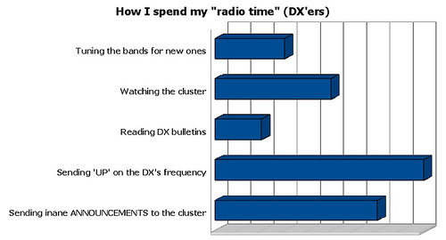
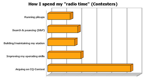
The hottest trend in reporting these days is the presentation of data in the form of big colorful graphs. Whether it’s showing how many people with size 8 shoes think the president is doing a wonderful job versus the number of left-handed albinos who think he isn’t, the infograph is a staple of modern journalism. This data is from the murky world of statistics, a branch of mathematics only slightly less confusing than new car warranty exceptions. Surveys and statistics have two really important attributes going for them that make them a lazy reporter/blogger/whatever’s dream: 1) 67.9% of all statistics are made up on the spot, and 2) big colorful pictures means you don’t have to write as many words.
Being one to never look a Trojan horse in the mouth, the staff of the Fi-Ni Report is hopping on the infographic bandwagon. Just like our favorite magazine publisher in Connecticut, we’re going to start filling up blank space with pretty pictures that may or may not accurately reflect the habits and attitudes of the amateur radio community. Make of them what you will.
Breaking news as reported by Chevy Chase circa 1982: "Just in-Meaningless statistics are up 23%"
ReplyDelete